
The visual landscape of the Horror Graphic Novels is a sophisticated ecosystem where color functions as a primary narrative engine, far exceeding its traditional role as a decorative or clarifying layer. In the specific intersection of sequential art and psychological terror, the Color Palettes act as a pre-rational communication system, designed to trigger evolutionary, cognitive, and visceral responses in the reader before the literal content of a panel is even processed. By manipulating specific variables—hue, saturation, value, and texture—creators can Manipulate Reader Emotion, establishing a state of chronic unease, guiding the eye through chaotic compositions, and signaling the breakdown of structural reality. This report provides an exhaustive analysis of the technical evolution and psychological application of coloring in horror comics, examining the shift from the mechanical constraints of 19th-century printing to the fluid, high-fidelity possibilities of modern digital painting.
The Neuro-Chromatic Interface: The Biology of Fear in Visual Storytelling
The efficacy of horror visuals is fundamentally rooted in the biological imperative of the human brain to respond to specific electromagnetic wavelengths. Neuroscience demonstrates that color does not merely represent an aesthetic choice but functions as a direct emotional trigger, influencing the amygdala—the brain’s emotional processing center—and the insular cortex, which governs the disgust response. In the context of horror, these neurological reactions are strategically exploited to create a “psychic effect” that plays upon the reader’s subconscious.
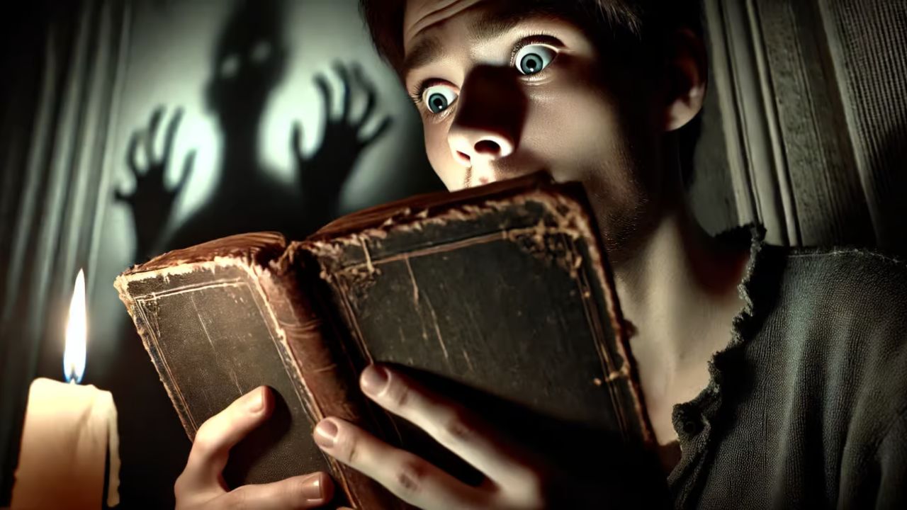
The color red remains the most potent tool in the artist’s arsenal due to its inescapable biological associations with blood, violence, and immediate physical threat. The presence of red signals a heightened state of alertness, as the brain historically associates the color with injury or predation. However, in the realm of sequential art, red is often applied with greater nuance than simple arterial spray. It is frequently used as a rhythmic motif to signal the encroachment of danger or the presence of a “supernatural other” long before the threat is explicitly revealed.
Conversely, colors like green, which are traditionally associated with life and growth, are recontextualized within the horror genre to represent decay, organic corruption, and the unnatural. Dark, sickly greens or neon, toxic shades trigger the insular cortex, alerting the reader to potential contamination or pathogens. This creates a sense of “unnatural bloom,” where the very environment feels fundamentally tainted or wrong. Blue, while often perceived as calming in neutral contexts, is utilized in horror to signify the cold unknown, clinical detachment, and the spectral realm. It creates a bridge between the living and the dead, emphasizing a spiritual or existential dread that contrasts with the visceral nature of red.
The psychological weight of these colors is further intensified through the manipulation of black and white. Black, as the color of darkness, represents the “unknown and unknowable,” forcing the prefrontal cortex to struggle with ambiguity and the loss of visual information. In haunted house narratives or psychological thrillers, the strategic use of black negative space creates a sense of entrapment and hopelessness, as the mind instinctively fills the “blank” areas with its own worst nightmares.
| Color | Psychological Mechanism | Horror Significance | Biological Trigger |
| Red | Danger and Alarm | Arterial trauma, obsession, the visceral | Amygdala (Alertness) |
| Black | Ambiguity of the Unknown | Darkness, entrapment, evil | Prefrontal Cortex (Information loss) |
| Dark Green | Decay and Sickness | Pathogens, organic corruption, poison | Insular Cortex (Disgust response) |
| Purple | Supernatural Mystery | Otherworldliness, alien presence, dreams | Default Mode Network (Supernaturalism) |
| Blue | Spectral Chill | Spiritual dread, clinical coldness, ghosts | Melancholic introspection/Existential fear |
| Yellow | Suffering and Jaundice | Mental instability, decay, suffering | Visual warning / Sickliness |
Technical Evolution: From Ben-Day Dots to Digital Textures
The history of comic book coloring is a journey from mechanical necessity to digital limitlessness, where technical constraints have frequently dictated the aesthetic boundaries of the horror genre. The shift from physical dyes and mechanical screens to digital layering has fundamentally altered how tension is constructed on the physical and digital page.
The Mechanical Constraints of the Pulp Era
For much of the 20th century, comic coloring was governed by the Ben-Day process, a printing technique patented in 1879 by Benjamin Henry Day Jr.. This method utilized small, evenly spaced dots of the four process colors—cyan, magenta, yellow, and black (CMYK)—to inexpensively create shading and secondary hues. In early horror pulps, these dots were a pragmatic solution for publishers, but they unknowingly created a specific visual “grain” that added to the gritty, disposable feel of mass-produced horror.
The colors themselves were often created using aniline dyes, such as Dr. Ph. Martin’s Radiant Watercolors, which were developed from coal tar by-products. These dyes offered an intensity and “punch” that traditional pigments could not achieve, but they were notoriously light-sensitive. Colorists in the mid-century period had to develop complex formulas for combining and diluting these dyes to ensure their work could be reproduced across the limited CMYK gamut of newsprint. The resulting aesthetic—characterized by high-contrast, primary colors and visible dot patterns—became a hallmark of the genre, influencing later artists who would enlarged and exaggerate these dots to evoke a sense of nostalgic dread.
The Digital Revolution and the Loss of Immersion
With the advent of digital coloring in the 1990s, particularly through Adobe Photoshop, the technical limitations of the Ben-Day process were largely eliminated. Colorists gained access to an infinite array of hues and sophisticated tools for rendering depth and lighting. However, this new clarity brought its own set of challenges for the horror genre. Many early digital efforts resulted in work that was “too bright and flat,” lacking the tactile, unsettling texture of traditional newsprint.
To counteract this, contemporary horror colorists often integrate “digital noise,” grain, and splatter effects to simulate the imperfections of physical media. The move toward “painted” styles, using digital brushes that mimic watercolors and gouache, has allowed for a return to an “earthy” and “organic” vibe that feels more appropriate for tales of decay and madness. The modern workflow often involves “flatters” who separate elements of a page into solid blocks, allowing the lead colorist to apply complex “ambient layers” and “shadowing” that direct the reader’s eye and establish the emotional temperature of the scene.
Printing Technology Comparison
| Feature | Ben-Day Process (Classic) | Digital Painting (Modern) |
| Origin Date | 1879 (Benjamin Henry Day Jr.) | Late 20th Century |
| Mechanism | Equally spaced dots on a grid | Pixels, layers, and blending modes |
| Primary Medium | Aniline dyes on newsprint | RGB/CMYK digital output on coated stock |
| Horror Effect | Gritty, “disposable” texture; coarse grain | High clarity, atmospheric lighting, immersive depth |
| Color Range | Limited by plate separation | Virtually unlimited |
Strategic Pacing: Paneling, Gutters, and the Chromatic Reveal
The graphic novel medium offers unique opportunities for tension through its physical structure—specifically the turn of the page and the arrangement of panels. Color is a critical component in “gaming the format” to maximize the shock of a reveal or the agony of suspense.
The “First Left” and “Last Right” Rule
In sequential storytelling, the most effective location for a “jump scare” or a shocking revelation is the first panel of a left-hand page. This panel is the only one truly hidden until the reader physically turns the page, allowing the artist to control the moment of discovery. Conversely, the last panel on a right-hand page is often used for cliffhangers or as a “bomb under the table”—a ghastly, highly saturated image that remains visible while the reader is looking at the preceding panels, creating immediate tension for the current scene.
Paneling as a Tool for Claustrophobia
The physical layout of panels can be manipulated to influence the reader’s sense of safety. “Tight panels” that strip away a sense of space and location can create a feeling of unease and claustrophobia, preventing the reader from knowing where a monster might be lurking. When these tight layouts are combined with desaturated or monochromatic color shifts, the reader loses their sense of direction, mirroring the disorientation of the characters.
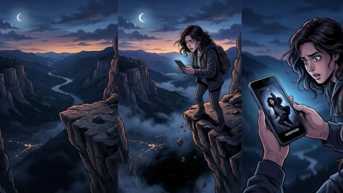
In digital vertical scroll formats (webtoons), the black margin between panels serves as a “tease” or “torture,” where each scroll provides new information while simultaneously raising new questions. The journey across these black voids creates a dread of the “uncanny reveal” that awaits at the end of the panel.
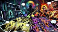
Case Study: The Fragmented Chaos of Matt Hollingsworth’s Wytches
The collaboration between writer Scott Snyder, artist Jock, and colorist Matt Hollingsworth on Wytches represents a radical departure from traditional horror coloring. Hollingsworth’s approach is a primary driver of the graphic novel’s psychological instability and supernatural dread.
The Splatter Technique and Visual Noise
Hollingsworth utilized a Photoshop layering process combined with a watercolor splatter technique that created a “garish” and “chaotic” visual field. This splatter does not merely represent a stylistic choice; it serves a functional purpose in the horror narrative. By introducing high levels of “visual noise,” the colorist prevents the reader’s eye from resting, maintaining a physiological state of high alert.
The wytches themselves are often partially seen or blend eerily into the chaotic background. This ambiguity is intensified by the color splatter, which keeps the creatures terrifyingly vague even when they occupy a significant portion of the frame. The iconic “Chittt-chittt” calls of the witches are rendered in large yellow letters surrounded by red, a bold contrast that pierces through the shifting backgrounds to signal an imminent threat.
Chromatic Fragmentation and Bleeding
In Wytches, the color scheme shifts dramatically when supernatural elements appear. The standard block colors of the mundane world are replaced by a disorienting mix of reds and blues. This “blurring of colors” creates a feeling of bewilderment and hopelessness. A key narrative device in the series is the “bleeding” of colors from one panel into the next. This erosion of panel boundaries suggests that the world-bending power of the wytches is too immense to be contained by the traditional structures of human perception, visually representing the breakdown of the characters’ reality.
Case Study: Emily Carroll’s Gothic Minimalism in Through the Woods
Emily Carroll’s anthology Through the Woods utilizes a more minimalist but equally impactful approach to color, focusing on the stark contrast between red, blue, and the black negative space of the page.
The Symbolic Power of Red Spotting
In the story “A Lady’s Hands are Cold,” Carroll demonstrates a mastery of using red as a visual anchor for violence. The protagonist is introduced in a blue dress with “red trimmings” and a “scarlet ribbon,” establishing an immediate association with the color of blood. As the narrative mystery deepens and the character becomes more frantic, the frequency of the color red increases within the panels. This creates a “psychic effect” that builds apprehension in the reader’s subconscious.
The color red also serves as a literal “visual cue” for violence. The murdered wife’s speech bubbles are rendered with white text on a red background, indicating that her very voice “embodies violence”. In “His Face All Red,” Carroll uses a sudden flash of red across a sequence of otherwise identical images to convey a murder that happens “off-screen”. This “subject-to-subject” transition forces the reader to use “closure”—the act of observing parts but perceiving the whole—to imagine the horrific action taking place in the space between panels.
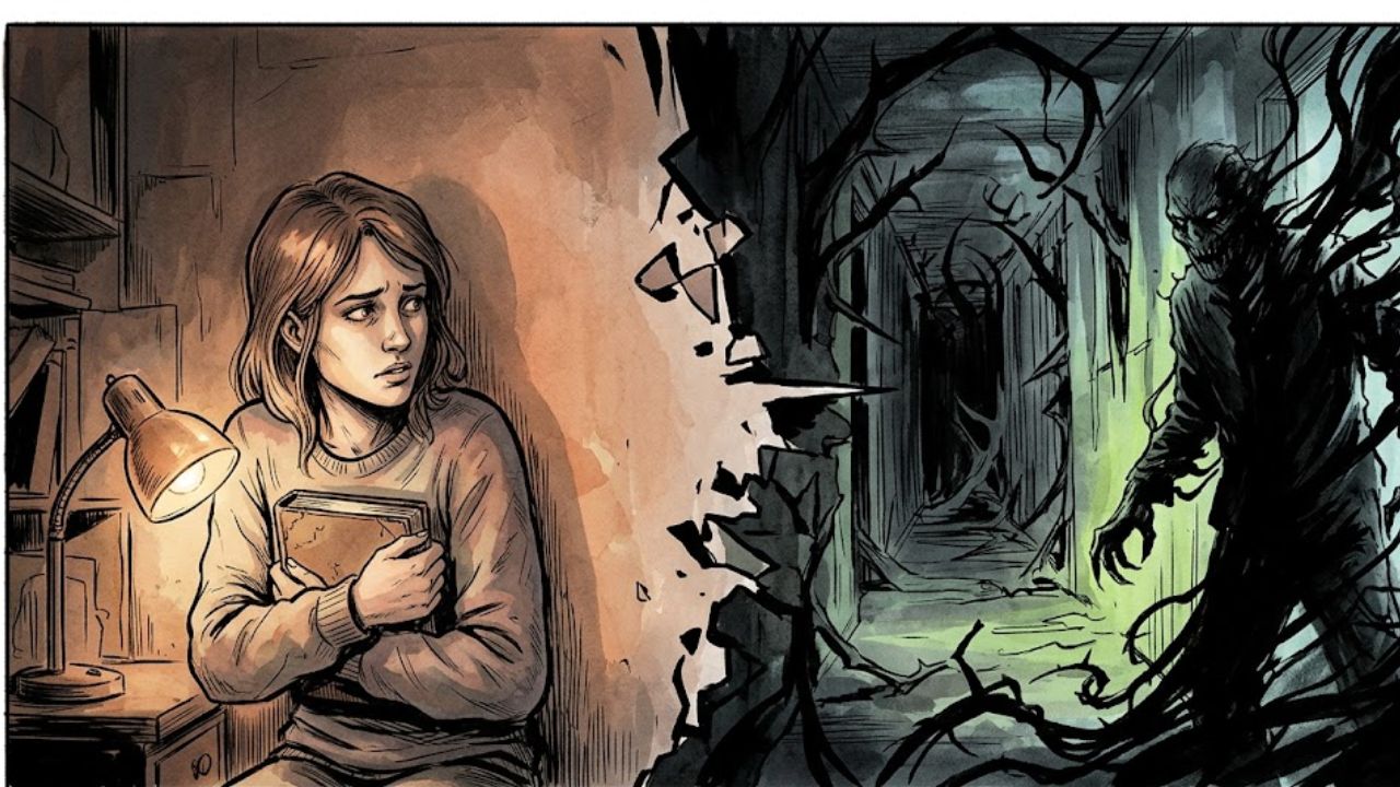
The “Bleed” and the Horror of the Abject
Carroll’s work frequently avoids conventional panel grids. Instead, panels often dissolve or “bleed” into the black darkness that lurks at their edges. This lack of identifiable distinction between the image and the negative space suggests that the characters are “forever threatened by the darkness massing just beyond their edges”. This stylistic convention gives form to the “abject”—the horror of boundary crossings, such as the line between civilization and wilderness or the self and the “other”. The erosion of aesthetic borders reinforces the unsettling nature of the narrative, as the horror literally seeps out of the panels and across the page.
Case Study: Tyler Crook’s Earthy Dread in Harrow County
Tyler Crook’s work on Harrow County (written by Cullen Bunn) illustrates how a “Southern Gothic” horror aesthetic can be constructed through earthy, naturalistic colors and traditional media.
Watercolors and the “Living” Environment
Crook utilizes watercolors and gouache to achieve an “earthy vibe” that distinguishes the series from the “flat and listless” work common in digital-first comics. By using rich browns, greens, and oranges, Crook grounds the story in a tangible sense of time and place. These hues provide the “lifeblood” of the comic, creating a setting so immersive that the reader can “hear the wind rustle” through the trees.
In Harrow County, the color palette is also used to represent the internal struggle of the protagonist, Emmy. The interplay between “midnight blues” and “golden greens” in sunrise panoramas serves as a visual expression of the “darkness vs. light” conflict that defines her journey. Crook believes that color can “lead the eye a lot better than ink can,” and his methodology of doing all the art himself—penciling, inking, coloring, and lettering—ensures a single, tight artistic vision where there are no conflicting ideas about how a panel should function.
The “Beautiful Horror” Philosophy
Crook operates on a guiding principle to “make it beautiful” when in doubt, but to use “A LOT OF BLOOD” when violence occurs. This contrast between the lush, watercolor beauty of the forest and the shocking, saturated red of gore creates a jarring experience for the reader. By establishing a consistent mood and atmosphere that emphasizes “hope and beauty and wonder” alongside horror, Crook creates a “Southern Gothic fairy tale” that feels more grounded and emotionally resonant than a standard slasher narrative.
Case Study: The “Cruel Paradise” of The Nice House on the Lake
In Jordie Bellaire’s coloring of The Nice House on the Lake, color is used to subvert expectations and create a sense of the “uncanny” within a domestic setting.
Saturation as an Emotional Affront
Unlike many horror comics that rely on desaturated, bleak tones, Nice House utilizes a fairly varied and intense color palette. Bellaire sets the story against vibrant backgrounds of deep reds, blues, and oranges, turning the titular lake house into a “cruel paradise”. This technique is used to heighten the “ambience” and create a disconnect between the beauty of the environment and the “stress and anxiety” of the characters. The colors effectively become an affront to the characters’ emotional states; it feels fundamentally “wrong” to enjoy the beauty Walter has created while the world is seemingly ending.
Character Totems and Flash-Forwards
The series uses color to distinguish its large cast of twelve characters, each of whom is given a title or “totem” such as “The Reporter” or “The Artist”. The color palettes change significantly during the post-apocalyptic flash-forwards to more muted and horrifying expressions of the characters’ fates. This transition between the “lush” present and the “bleak” future serves as a constant visual reminder of the impending doom, maintaining a baseline of tension even during moments of apparent calm.
Advanced Chromatic Strategies: Spot Color, Chiaroscuro, and Textural Noise
Beyond character-driven case studies, several advanced technical strategies are employed across the horror genre to manipulate reader psychology.
Chiaroscuro and the Power of Contrast
Chiaroscuro, the use of strong contrasts between light and dark, is a fundamental technique for creating “suffocating visions” and “existential dread”. By emphasizing the physical deterioration of space through shadows, artists can reflect the psychological fragmentation of their characters. In comics like The Long Halloween, contrast is used to paint a vision of Gotham that is both elegant and iconic, relying on the absence of light to suggest the horrors lurking within the shadows.
Spot Color and Monochromatic Subversion
The use of limited palettes—often restricted to one or two colors plus black and white—can add immense dimension to a story. This process, common in “noir” or “thriller” horror, involves using a single spot color (frequently red) to draw immediate attention to key narrative elements. By screening down the “black plate” to add gray tones and mixing them with the spot color, artists can create a wide range of subtle variations that influence the “emotional temperature” of the image. This technique forces the reader to focus on value and intensity rather than a complex array of hues, heightening the impact of every chromatic choice.
Textural Noise and “Unreliable” Rendering
Modern horror colorists often apply digital textures that mimic grain, dust, or biological rot. This “textural noise” serves to make the visual field feel “unreliable” or “tainted”. When combined with “unconventional panel layouts” that disrupt the traditional narrative flow, these textures challenge the reader’s ability to “read” the scene clearly, increasing the sense of psychological uncertainty. The use of “desaturated palettes”—pale grays, faded yellows, and sickly greens—evokes feelings of decay and the supernatural without explicitly depicting them, allowing the reader’s imagination to “fill in the gaps”.
Comparative Strategy Matrix
| Strategy | Technical Implementation | Narrative Purpose | Psychological Impact |
| Spot Color | Red/Black integration; screened tints | Highlight violence or obsession | Heightened alert/Focus |
| Chiaroscuro | Stark contrast; high-value shadows | Portray isolation and mystery | Claustrophobia/Dread |
| Ambient Layers | Soft Light/Multiply blending modes | Distinguish location and time | Visual orientation |
| Texture Noise | Digital grain; watercolor splatter | Simulate rot and unreliability | Disorientation/Revulsion |
| Desaturation | Muted hues; pale grays/yellows | Signify sickness or clinical dread | Melancholy/Subtle unease |
Conclusion: The Psychopathic Pacing of Visual Terror
The manipulation of color palettes in horror graphic novels is a psychopathic process of building up audience expectations only to subvert them in horrific ways. Whether through the “garish” chaos of Matt Hollingsworth, the “minimalist” violence of Emily Carroll, or the “earthy” dread of Tyler Crook, color serves as a direct bridge to the reader’s primal fears. It clarifies the storytelling while simultaneously destabilizing the reader’s sense of reality.
The evolution of coloring from the mechanical Ben-Day dot to the high-fidelity digital layer has not replaced the need for texture and atmosphere but has rather provided colorists with more sophisticated tools to simulate it. The future of horror in sequential art lies in the continued synthesis of these traditional and digital methods, using “ambient layers,” “textural noise,” and “strategic reveals” to ensure that the reader remains in a state of constant, chronic tension. By understanding the neuro-chromatic interface between the eye and the brain, horror creators can architect a visual experience that lingers in the reader’s subconscious long after the final page is turned. The chromatic architecture of dread is not merely about what the reader sees, but how the colors make them feel—forcing them to navigate a world where the shadows are never truly empty and the beauty is always a cruel paradise.


